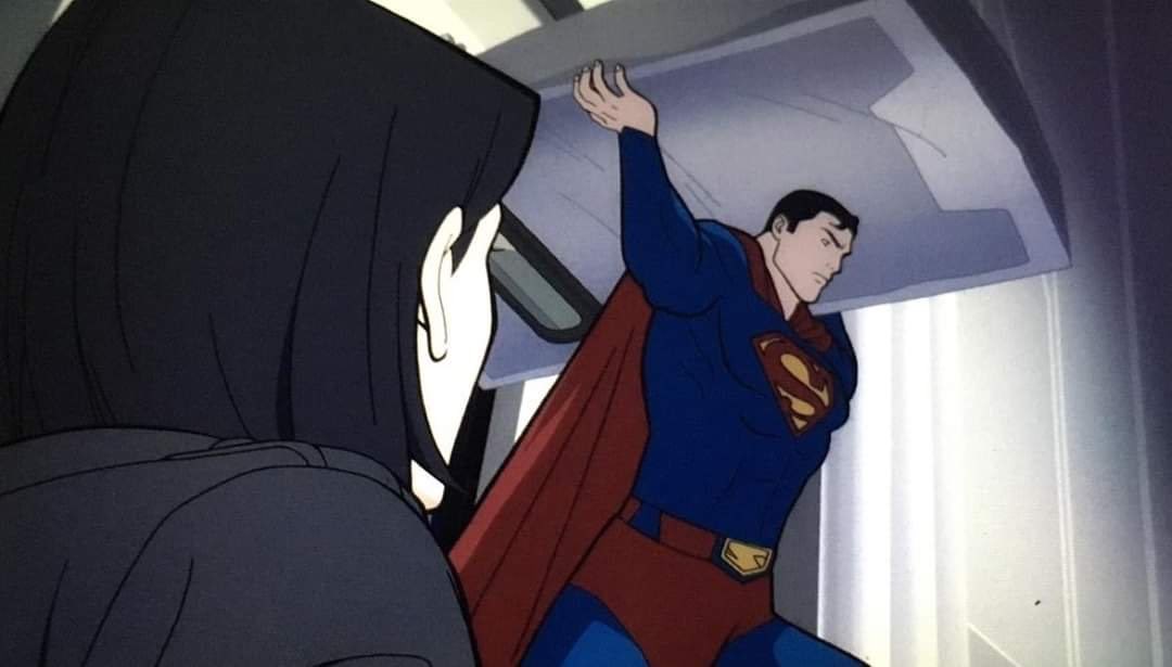
New images from the upcoming animated movie “Superman: Man of Tomorrow” have been posted online, showing us Superma, Clark Kent, Martian Manhunter, and Lobo.


The original story for “Superman: Man of Tomorrow” finds Clark Kent working as an intern for the Daily Planet and learning on the job how to save the city of Metropolis.
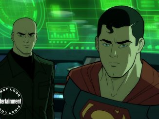
Darren Criss, who can be seen on Netflix this weekend starring in Ryan Murphy’s new drama Hollywood, will lead the Superman: Man of Tomorrow cast as the big blue boy scout himself. Zachary Quinto, who got his start playing the murderous supervillain Sylar on NBC’s Heroes, will here voice one of the greatest supervillains of all time: Lex Luthor. Alexandra Daddario (San Andreas) will voice Lois Lane.
Additionally, Superman villains Lobo and Parasite will also feature in the film, with Ryan Hurst (The Walking Dead) voicing the role of “The Man Man,” while the Parasite (Rudy Jones) will be voice by Agents of S.H.I.E.L.D. star Brett Dalton.
The rest of the voice cast includes Ike Amadi (Mass Effect 3) as fellow superhero Martian Manhunter, Neil Flynn (Scrubs) as Jonathan Kent, and Bellamy Young (Scandal) as Martha Kent. Superman: Man of Tomorrow is directed by Chris Palmer (Voltron: Legendary Defender) and written by Tim Sheridan (The Death of Superman), with Butch Lukic (Justice League, Batman Beyond) serving as supervising producer.
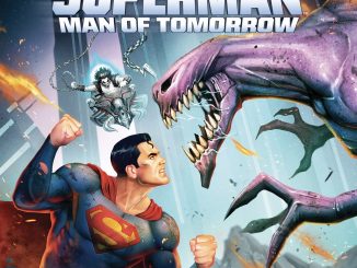
Pre-order “Superman: Man of Tomorrow” on 4K Ultra HD Blu-ray Combo Pack and Blu-ray Combo Pack from Amazon.com.
Glad the trunks are back!
Looking forward to this movie.
Horrible animation.
How can you say that? There’s no footage of it, so you can’t possibly judge its animation.
Sometimes when folks are talking about animation they’re more specifically referring to the visual design. In this instance yes, we haven’t seen how anything moves but we can form an opinion on the look. You can have great animation in terms of movement and have it still look like crap because of the design style. On the other hand you can have some great looking designs that are pleasing to the eye but the production doesn’t have the budget to make them move or has to resort of a lot of stock animation (which isn’t always bad but will be… Read more »
It looks “simple” at best.
Looks like anime. Doesn’t look simplistic at all. I mean, it has more detail than some of Bruce Timm’s animated movies.
Interesting photos. The photo of Superman kinda reminds me of the Ruby Spears Superman animated series. I look forward to seeing this film. 🙂
You beat me to it. I was going to say the same thing.
Yeah, seeing these photos makes me want to watch the Ruby Spears Superman series. 😀
13 episodes only…but to us it’s a classic. I’m happy to say I’m a proud owner on DVD
And I just love the intro for the show. A take on the classic John Williams Superman theme but they added in their own notes as well. I could watch that intro on repeat and I would never get board. 🙂
I really did love that series. Too bad we couldn’t have more seasons back then. Hmmm…..but in today’s age of superheroic wonder on both the small and the big screens, wouldn’t it be great if DC Universe did a season 2?
Count me in for that Kal-Ed! 😀
Same style…new voice actors.
Don’t really like what’s going on with the belt.
Having it be the same color as his trunks doesn’t look good IMO and I’ve always thought that having an S on his buckle is visually redundant when it’s already prominently displayed on his chest. Don’t really like the blue loops either.
I’ll reserve the judgement until I have seen the finished product. But I like what I’m seeing so far. Looks simple but maybe going to be effective.
It’s been a long time since we’ve seen this kind a “smooth” look. I hope that doesn’t translate into an adolescent story line. I hate to say we’ve gotten accustomed to the jagged, almost exaggerated facial expressions that have been drawn. From that above shot it’s nice to see Superman with actual “eyeballs” instead of slits and lines for facial expressions.
Some animation films had their flaws but they worked their purpose just fine when it came to facial expressions. That excluded Mangas because we know how overreacted some facial expressions might appear to the finished product. Some are Hilariously funny and some are pretty much over exaggerated. That’s when critique arrives from fandom when it comes to a certain style they are used to and when back to basics apply again, less is more and pretty satisfying. Can’t wait to see this.
I’m still deciding about the artstyle. One thing I’m little concerned about is that it might be taking cues from that Max Landis book.
The American Alien run!?
Guess we can say it was an OK read but not a world shatteringly modern day classic
Not fond of the AA run. It’s the shot of him in the goggles that made me think of the proto costume from that. Least he doesn’t have a Batman cape.
The art style seems fine to me. I don’t see why people are complaining about that. It’s no better or worse looking than anything else DC animation has done.
My problem has always been with the frame rate. Like they have been animating their movies at 15 fps to save production time. They haven’t had smooth animation in years.
Well….they’ve drawn him differently in just about every other animated feature. Costumes different, face different, body build different, personalities different, you name it. This is a throw back look, old style. Hopefully we won’t get a story line that ends up being kiddie.
Maybe but I don’t want another Dan Didio slaughterfest like we just got.
Matt…what are you referring to as far as a slaughter fest?