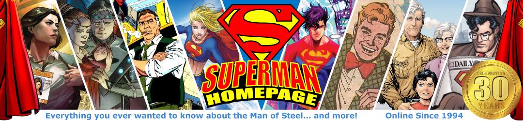
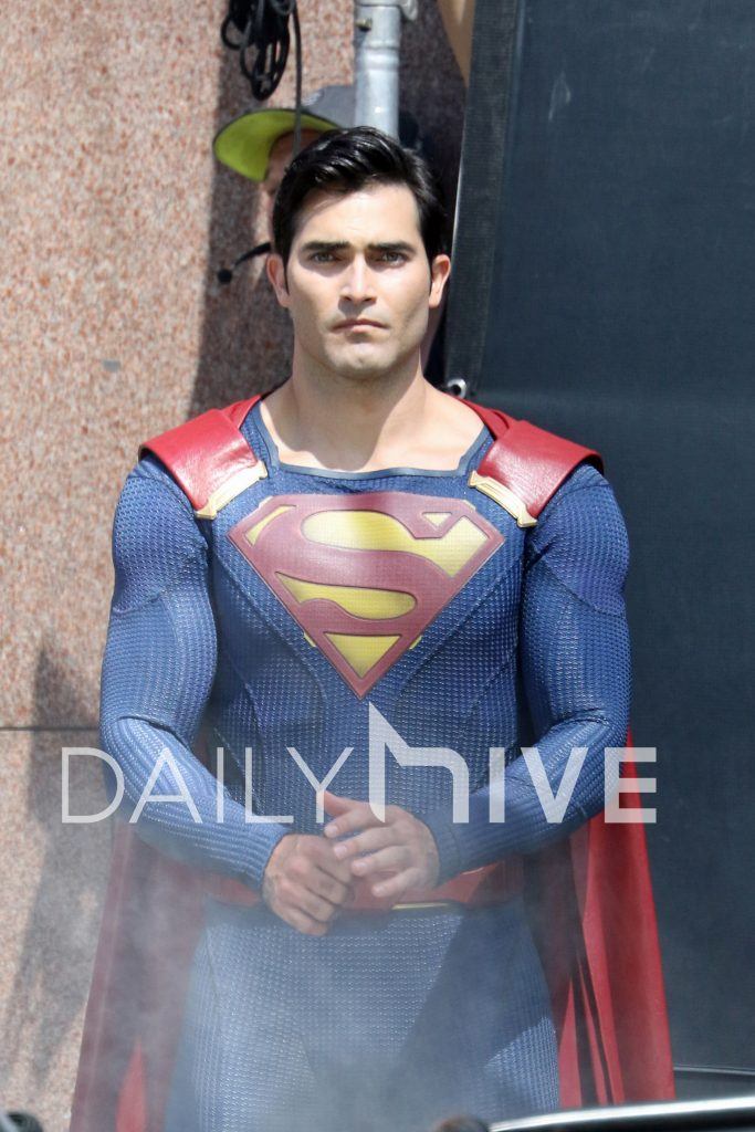
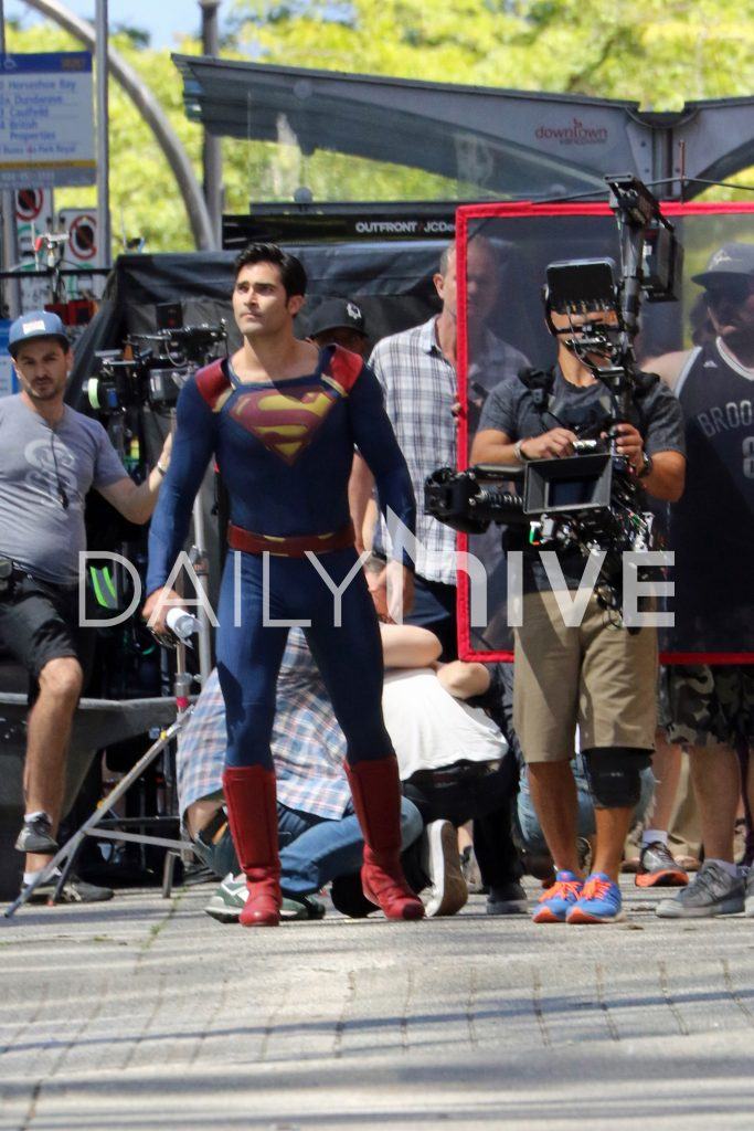
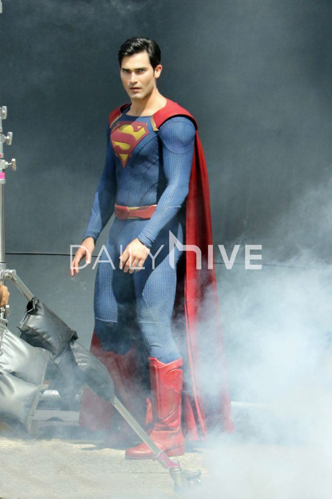
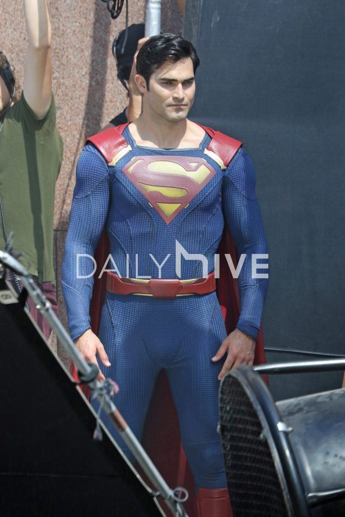
New photos of Tyler Hoechlin as Superman have emerged from location shooting for the first two episodes of Season 2 of “Supergirl”.
DailyHive.com has posted a number of photos from filming which took place near the Canada Post building in downtown Vancouver, as Superman protects a group of citizens.
These photos give us a better look at Tyler in the new Superman costume, showing us just how blue the suit is, and that Hoechlin looks quite muscly in the suit after all.
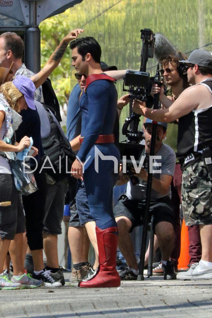
Videos from the set have also emerged.
Cape looks ridiculous. WTF? Shoulder straps? And this guy doesn’t look at all like the Man of Steel. Blurg.
It (cape) kinda looks like it has been stitched or, taped on with (gold) tape on!
Well, it’s definitely a loose adaptation and melding of the New 52/Rebirth costumes. The belt is all kinds of off-putting.
With his arms covering the rather “useless belt, it really looks like he is wearing a pair of “long johns”. As these designers toil so hard to distance themselves from the “Red Trunks” (a necessity on this design) and by doing so, making design faux-pas – as it look unappealing (funny)especially at different angles or certain aspects are covered up.
The classic suit was just so much better in it’s layout and approach design, as it had all aspects covered, while being viewed at any angle.
Now that’s definitely better! Tyler looks super in these pics. I think the suit looks more like Injustice Superman Prime.. Not a fan of the boots though, as they look too big
This earth lacks good superheroes costumes… Looks embarrassing!
The colors on the costume look really good, but other than that, same issues as before.
Well, that certainly looks better! Can’t stand the cape, though. Yeesh.
Here’s hoping it looks better – somehow – on-screen.
The cape will clearly be predominantly CGI just like the Martian Manhunter and the Hawks in Legends of Tomorrow, the red plastics here are for placement.
Love the natural light on the suit…colors look much better here. Hoechlin looks great! Even has his hair going the proper Superman way (back and slightly to the left), he’s just missing the “S” curl. Honestly, the only thing Cavill’s suit has on Hoechlin’s is the proper “M” for “man” boots, and the way the cape goes into the shirt. Hoechlin’s “S” shield size and design looks 100 times better than Cavill’s, I only wish he had the proper red trunks and yellow belt, then he’d really look like Superman. Not really keen on the whole honeycomb/reptile skin design of… Read more »
DC – just doesn’t like perfection!
All of this, these needless changes trying to substitute for something that needs to be, as (DC) already had the blue-print for the perfect costume lay out. (it really is “color by numbers”) resense and repeat.
All of this nonsense, just for the lack of “Red Trunks”!
Right on, Jer! The people who created Superman got his costume right! Red trunks Superman is the correct Superman! Jim Lee, Dan Didio, and all the other people responsible for New 52 and the snyderverse are bigger fans of themselves than they are the characters, and have consequently ruined the costumes and characters in their sad devotion to their warped perspectives.
DC is just too reluctant to admit their “Error” in banning the trunks in the first place as essential piece to this costume, and most people know it was a mistake because the company keeps trying to “poorly substitute” other items (in this case a bulky red waist band aka belt) which just don’t jibe with what is supposed to be, and that is: ”Red Belted Trunks” The new look costume(s) and above look either; cheap, out of place, incomplete and Halloween-ish or, combinations thereof. The warped or, lack of simple logic with perception, just totally escapes me, with this… Read more »
And when I thought that I couldn’t see a worse design than the previous ones…I see this. This is a big, big….BAZINGA!
But at least he has his colours as they should be.
It looks better in this light. I’ll give it that. Also, I hate to say it, but dude does a lot of squats, doesn’t he? That may be why the trunks are gone…
Nah, the trunks would help him look more modest.
Oh God no……I’m so disappointed in the CW right now. Why fix perfection when the CW already have a Superman actor (played the character for 10 freaking years), who still young enough and mature enough to play Supergirl’s older version of the Man of Steel. The producers on Supergirl are freaking idiots. Tyler is way too short. They have a Jimmy Olsen (same height as Tom Welling) that towers and looks more “Supermanly” than Tyler. Tyler is very handsome, don’t get me wrong here but he looks more like Robert Patterson/Edward Cullen from Twilight wearing a Superman costume. I’m surprised… Read more »
Why? Because Welling never wanted to be Superman in the first place. “No tights, no flights” – those were the terms of his contract through the first 217 1/2 episodes of the series. (I say 217 1/2 because the tights, even if they were more CGI than real life, and the flights, didn’t happen until the last half hour of the series finale.)
Besides, as of right now Hoechlin is appearing in only two episodes. He’ll do fine.
To me it’s just a strange way to approach the cape attachment. Usually even if you’re not doing the classic sort of tucked into the collar look (like Kara’s) the cape at least overlaps the sides of the collar (Kirk Alyn for example). Why have the collar so huge if the cape is barely even near it?
At least I hope the colors come through in the show and don’t get filtered within an inch of their life.
It very “Roman” “knights of the Roundtable” approach, (or, it reminds me of) in how they attached their capes, Besides, some designers just have to put their “signature” on things for the better or worse. As the constant mis-tinkering (mis-updating) of the classic goes on….
I do like the costume & it is keeping with the Supergirl tv series world in that her costume looks similar texture wise. I don’t like the ommission of yellow belt & red underpants (I never really thought of the latter being underpants – though most people do!) but hey its 2016 & this is a modern take on character. Me? I’d employ Chris Reeve costume forever & even Salkinds Superboy series costume but time moves on. The Henry Carvell suit is just ‘ok’ for me, this looks a little brighter & better but we await tv series to view… Read more »
Trunks. The word is trunks. I never really thought of them as being underpants either. Also always wondered why it was only Superman that ever got any flak about it when even the grimdark fans precious Wolverine had trunks at the height of his popularity.
Yep — neither did I…
With-out the “Red Trunks” the suit looks like even more undergarments (long-johns with the flap in the back) and it is amazing that some don’t understand that.
All of these (needless) changes have done nothing but make a mockery of the costume and situation.
People always say “this is a modern take on the character” to justify the lack of trunks…. but what does modernization have to do with red trunks? How do red trunks possibly date the suit? I don’t get it.
For legal and aesthetical reasons.
Individuals that quote, “modernization” in this case are speaking purely form a very biased, if not, heavily and wrongly influenced position by peers, totally void of any logic in their arguments.
The colours look better & the S is great. Tyler looks great too – I feel bad for the guy that a lot personal criticism he recieved was because of a bad photo. The boots are still too chunky, the cape is truely awful – how on earth did that get passed??? – & the belt actually looks worse, it’s too high – he looks like Simon Cowel with his high waist bands & it makes Tyler’s torso look smaller than it should. How hard can it be to design a Superman costume??? There’s decades of creativity to cherry pick… Read more »
Yeah the suit is not really on Tyler anymore than the problems with BvS are on Cavill. I think most fans are more than willing to see what he does in the part we’re just reacting to and debating the suit design itself.
I’d rather watch this new series with Superman appearance than Snyders Superman / Justice League stuff. Roll on a Superman tv series, Superman The Movie still unbeaten in nearly 40yrs!
The suit looks cobbled together; too many busy ideas for a simple and classic design, but Hoechlin looks the part here. All the man needed was some sunlight and a good razor.
Cobbled, yes indeed! and yes he does look the part
Can’t stand the collar opening, that’s to much skin! maybe it will be covered more with CGI cape.
Not perfect, the same issues persist from a purely design-standpoint, but the overall look is indeed A LOT better in these pictures. Some of my facebook lady-friends really, REALLY enjoy that butt in the last picture (obscured by the watermark here).
The cape and boots are the worst part this looks better then the promo shot but still what were they thinking on that cape … I can live with the boots … I get they were trying to do an injustice thing and I understand they don’t have the budget for somethin like bvs/mos suit but man that cape is ugly… The S from the promo shot was the best part til I saw the little square things in. The four corners what’s that about ?
Seriously, what is up with thee boots, cape and neckline?? Everything else looks fine, but those things completely ruin it.
Man that collar looks so strange. Almost like a weird cosplay version of the suit.
But other than that and some really minor (and growing smaller with every new image and video) gripes regarding the boots and belt….I think that’s a decent Superman.
I think they were trying to make the suit too many things taking bits and pieces from here and there… Boots and the lines design was definitely taken from new 52 superman the original boots were the same style…. The cape and shoulder attachment looks like injustice… And the neckline is definitely inspired by Man of Steel The S is just about perfect probably the best looking S since the superboy television series … In terms of looking exactly like what we considered the “classic” S symbol…. Although they ruin it with the little rectangles in the four edges…. The… Read more »
Certainly better the the first promo pic, but the belt still looks weird and the shoulder strap cape look terrible imo.
Overall I like the look it is different but still retains the look of SUPERMAN
What a contentious discussion. Looks decent enough to me.
I’m still disappointed with the dark colors,but I this guy looks better than Cavil
Sorry, but he looks rather like Barbie´s boyfriend Ken than like Superman. “Man of plastic” rather than “Man of steel”. Or maybe like a semi-professional cosplayer, but not Superman.