2005 Comic Book News Archives
May 11, 2005: Richard Bruning on Designing New DC Logo
Newsarama sat down with DC's Senior Vice President - Creative Director Richard Bruning to learn about the process and what goes in to designing a new logo. Here's an excerpt from the lengthy interview...
- Q: How many designs made the semifinals?
A: Without getting into the nuances of every design, we narrowed it down to about nine designs to present to Paul, because he didn't want to see the hundreds of variations we'd come up with, because he knew it would drive him crazy, plus he trusts George and I, which I am always very grateful for.
We put nine up on the wall, and George and I had already done a pre-cut - we knew how we ranked them. But we were shocked - Paul, almost on every single one, called it the same way as George and I had. By the time we were done, we were all laughing, because we knew we were all headed toward the same goal, which is a wonderful experience to have.
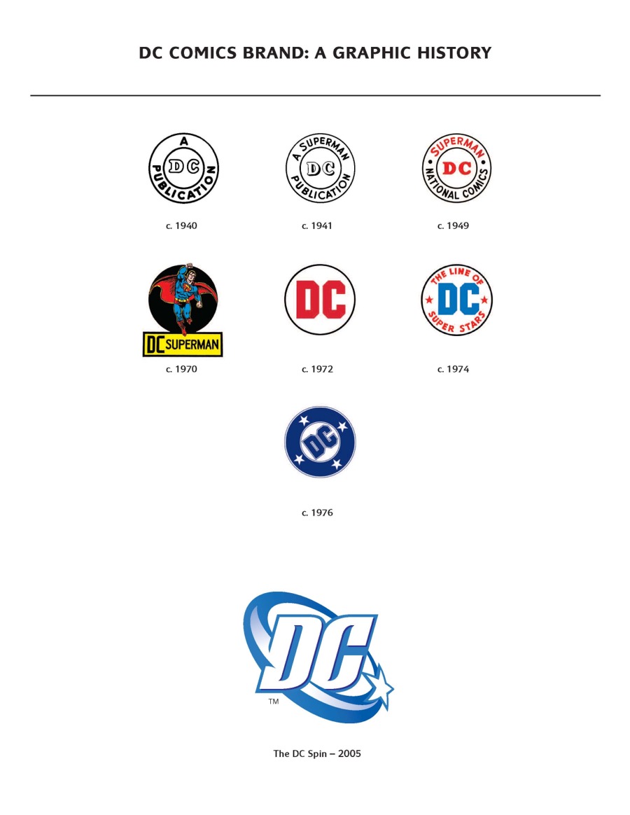
Q: As you said, the logo that Glaser designed in the '70s was more strictly about comics than this one is. With that in mind, when looking for the new logo, one that has to embody not just the publishing, but the entire package that is now DC, what concepts needed to shine through? For example, a quick look at the logo would tell someone who knew nothing about DC what?
A: Our world is about energy. It's about power. It's about creativity. And that's a kinetic energy in movement, even if it's not a physical energy at times. Again, and not to fault Mr. Glaser's design, the previous mark was flat. It was created to be flat.
Two forces, one over the last decade or so, particularly due to the computerization of design work, embossed and three dimensionalized company marks have become very prevalent. The mark as Milton created it was virtually impossible to move into anything other than a flat representation. If you tried to emboss it, or turn it, or do anything to it, it was unforgiving in that sense. It wouldn't do that.
So, going into it, that was one of our goals - we really wanted to be able to lift it off the page. We wanted it to convey motion and convey energy. Well, you're still working in a static medium, so how do you do that? In this case, by using the star, both as a historic element, and using it in motion.
By taking the star and having it move in space, as it moves from small and dark in the back to lighter and larger in the front, you innately build motion into it. That was the way that solution helped this mark pop out from all the other designs - it has motion built into it, and that was what we thought was going to be one of our most difficult challenges to achieve. And as you'll see when the film version comes out, it lends itself extraordinarily well to animation.
The other thing was that we wanted "D" and "C" to be bold. Bold and clean and readable from a mile away, no mater what size it was. As it now stands, we tested the mark to incredibly tiny sizes - down to a quarter of an inch, and in the simplified version of it, you can still read "D" and "C" - you can tell what it is. That was our other major design hurdle to handle.
We also wanted to make sure it looked dynamic and flexible, but didn't look heavy handed - it shouldn't look industrial.
2005 Comic News
Listed below are all the Comic News items archived for 2005.- January 7, 2005: Loeb Talks About Supergirl
- January 10, 2005: Dwayne McDuffie Talks Up-Coming “Justice League Unlimited”
- January 16, 2005: Superman Comics Amongst Best Sellers for 2004
- January 26, 2005: Karl Kerschl Signs 2-Year Exclusive Contract with DC
- January 27, 2005: Dan Didio Talks About “DC Countdown”
- February 9, 2005: Three Issues of JLA's “Sydnicate Rules” Have Sold Out
- February 15, 2005: Superman Copyright Lawsuit Explained
- February 20, 2005: DCU Panel at WonderCon
- February 23, 2005: “Superman #213” Sold Out at DC Comics
- March 1, 2005: Superman Comics Return to Argentina
- March 3, 2005: Battle for Superman Ownership Explained
- March 8, 2005: “Superman #215” to Feature Second Cover
- March 20, 2005: Superman Panel at Wizard World LA
- March 21, 2005: Kennedy Talks “Superman: Infinite City”
- March 22, 2005: Comic Buyer's Guide Honors DC Comics Talent
- March 25, 2005: Lee Bermejo Talks “Lex Luthor: Man of Steel”
- March 25, 2005: Superman Related Information in “Wizard #163”
- March 28, 2005: DC's Countdown to Infinite Crisis on Sale this Week
- March 29, 2005: “Lex Luthor: Man of Steel #1” Sold Out at DC Comics
- March 30, 2005: “Countdown to Infinite Crisis” Sells Out, Rushed Back to Press
- March 30, 2005: Superman Stars at Comic Conventions
- April 4, 2005: Jeph Loeb Talks Supergirl
- April 14, 2005: “Action Comics #1” and “Superman #1” on Auction
- April 19, 2005: DC Comics Rushes Sold-Out OMAC PROJECT #1 Back to Press
- April 21, 2005: Mark Verheiden Talks “Superman”
- April 24, 2005: “Villains United #1” Sells Out at DC Comics
- April 25, 2005: 1st Annual Shuster Awards in Canada
- April 26, 2005: Superman Artist Ed Benes Renews Exclusive Agreement with DC
- May 8, 2005: DC Comics to Unveil a New Logo
- May 8, 2005: DC Comics Rush Solicits “Prelude to Infinite Crisis” Special
- May 9, 2005: DC Comics Unveils New Logo
- May 10, 2005: “Superman #214” Sells Out at DC Comics
- May 10, 2005: “Superman/Batman #19” to be Reprinted as “Supergirl #0”
- May 10, 2005: Michael Turner Provides Variant Cover for “Supergirl #1”
- May 10, 2005: Ed Benes on Drawing Superman
- May 11, 2005: Richard Bruning on Designing New DC Logo
- May 17, 2005: “Omac Project #1” Returns to Press for a New Third Printing
- May 18, 2005: DC Offers Retailers Superman Action Figure with “Justice #1”
- May 23, 2005: Jeph Loeb Talks “Superman/Batman” With a Vengeance
- May 23, 2005: DC Sends “Villains United #1” Back for Third Printing
- May 24, 2005: More Superman Comics Sell Out at DC
- May 25, 2005: Jeph Loeb Talks Superman - Past, Present and Future
- May 30, 2005: Karl Kerschl “Adventures of Superman” Page By Page PodCast
- June 1, 2005: OMAC Units in ”Adventures of Superman #640”
- June 6, 2005: Karl Kerschl “Adventures of Superman” PodCast Part 2
- June 7, 2005: “The OMAC Project #2” Sells Out at DC
- June 14, 2005: Eddie Berganza to Leave Superman Books for JLA
- June 15, 2005: “Superman/Batman #20” Sells Out at DC Comics
- June 15, 2005: Karl Kerschl Sketch Session - Drawing Darkseid
- June 17, 2005: Sad News for the Loeb Family
- June 20, 2005: Gail Simone Talks About “Action Comics” and the Core of Superman
- June 20, 2005: “Villains United #2” Sells Out at DC Comics
- June 23, 2005: Paul Cassidy, the Man Credited with Putting S on Cape, Dies
- July 5, 2005: DC Comics Panels at San Diego Comic Con
- July 7, 2005: Alex Ross Talks “Justice”
- July 12, 2005: “Identity Crisis #1” Final Printing Sold Out at DC Comics
- July 17, 2005: Superman Panel at San Diego Comic Con
- July 17, 2005: DCU Panel at San Diego Comic Con
- July 27, 2005: Greg Rucka Talks “Sacrifice” in Superman Books
- July 27, 2005: Parts 1 & 2 of Superman “Sacrifice” Storyline Sold Out at DC
- August 2, 2005: DC Sends 4-Part “Sacrifice” Story Back to Press
- August 3, 2005: Karl Kerschl PodCast on Creation of “Adventures of Superman #642”
- August 9, 2005: Jeph Loeb Talks About Supergirl
- August 9, 2005: DC Lowers Prices on First Two Showcase Collections
- August 9, 2005: Greg Rucka's “HorCast #14” PodCast Online
- August 10, 2005: DC Announces Collected Editions for Nov-Dec 2005
- August 14, 2005: New Printing of “Supergirl #1” Follows One-Day Sellouts!
- August 16, 2005: DC Announces Michael Turner Supergirl Variant Covers
- August 16, 2005: Press Release - Horhaus.com PodCasts
- September 12, 2005: “Adventures of Superman #643” Back to Press
- September 13, 2005: “Supergirl #1” Gets Third Printing
- September 13, 2005: “Infinite Crisis #1” Preview
- September 14, 2005: HorCast #20 - A Chat with Eddie Berganza
- September 15, 2005: Jeph Loeb on “Superman Returns”, “Infinite Crisis”, and “Supergirl”
- September 20, 2005: Justice Prevails as “Justice #1” Sells Out at DC
- September 22, 2005: HorCast #21 - Eddie Berganza Chat Part 2
- September 29, 2005: “Justice #1” Gets Second Printing
- September 30, 2005: “All-Star Superman” Preview
- October 3, 2005: Neal Adams Covers “All-Star Superman”
- October 15, 2005: Gail Simone and John Byrne Leave “Action Comics”
- October 18, 2005: Gail Simone Talks Leaving “Action Comics”
- October 19, 2005: Neal Adams Provides Variant Cover for “All Star Superman #1”
- October 20, 2005: DC Comics Announced Variant Cover for “Supergirl #4”
- October 26, 2005: Mark Verheiden Moves to “Superman/Batman”
- October 30, 2005: Gail Simone Talks “JLA Classified #16”
- October 30, 2005: Mark Waid Talks “Superman Returns” and “Birthright”
- November 2, 2005: Armageddon Expo - Auckland New Zealand October 22-24, 2005
- November 9, 2005: Crisis Counseling with Dan Didio
- November 15, 2005: Marv Wolfman Talks “Infinite Crisis Secret Files 2006”
- November 27, 2005: Greg Rucka to Take Over Supergirl
- November 30, 2005: DC Comics Superhero Stamps in 2006
- December 14, 2005: Supergirl Joining the Legion of Superheroes
- December 19, 2005: Josh Middleton Talks “Shazam/Superman First Thunder”
- December 20, 2005: Meltzer to Relaunch JLA Comic Title
- December 21, 2005: Second Printing for “Justice #2”
- December 22, 2005: Brad Meltzer Talks Taking on the JLA
Back to the News Archive Contents page.
Back to the Latest News page.