Movies
Comparing the Superman Movie "S" Shields
When Warner Bros. released the official logo for "Man of Steel" via the movie's Facebook page back in March 2012, there was a lot of discussion about its design, color and appearance.
So let's look back and compare all the promotional logos released for "Superman: The Movie" in 1978, "Superman Returns" in 2006 and "Man of Steel" in 2012 and see how they compare to what was used on the costume for each film.
Some of the complaints and comments posted online regarding the "Man of Steel" logo centered around its color, specifically in relation to the darkness of the red and how there was really only a hint of yellow.
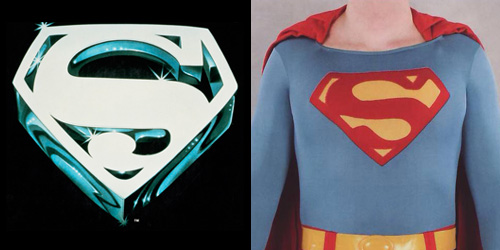
Looking back to the "S" Shield released to promote "Superman: The Movie", you can see straight away that there's not a hint of red or yellow whatsoever. We have a totally white "S" in an extruded 3D design with crystalline shades of blue and reflective highlights.
The "S" Shield released to promote "Superman Returns" on the other hand did have the red and yellow color scheme more consistent with the classic "S" symbol etched in our minds, although with darker hues. Again the promotional design has a 3D definition to it.
It's also interesting to note that the "S" Shield used to promote "Superman: The Movie" looks nothing like the "S" symbol that was used on Christopher Reeve's costume. It's a totally different shaped design. While the "S" used on the costume is closer to the "classic" design, it does vary slightly.
The symbol for "Superman Returns" is almost identical to what was used to adorn the costume, right down to the 3D bevelled look.

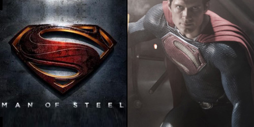
As for "Man of Steel", the colors are obviously not the same as what was used on the costume for Henry Cavill's first outing as Superman, although the shape of the "S" is almost identical. The shield on the costume, while slightly raised, isn't as extruded as the promotional logo, and doesn't have the same texture or line designs.
So, in summary, "Superman: The Movie" used a completely different shaped and colored "S" to promote the film than what was seen on the costume, and many consider it the best superhero movie of all time.
"Superman Returns" used the same shaped and colored "S" to promote the film as what was seen on the costume, and it was both loved and hated by many.
"Man of Steel" took an each-way bet, using the same shape but different colored "S" to promote the film to what was seen on the costume, and again, it was loved and hated by many.
So what does this all mean? Not much really. What I do know is this... whether a Superman movie is loved or hated usually doesn't rest on the design of the "S" Shield. It's just one small element in a much more complicated discussion. Nevertheless, it's interesting to look back and compare what has been done.
Steve Younis