Movies
Superman Costume Tweaks - "Man of Steel" to "Batman v Superman" Comparison
By Steve Younis
 With the release of the first photo of Henry Cavill as Superman for "Batman v Superman: Dawn of Justice", eagle-eyed fans have been spotting the differences between this new costume and the one seen in "Man of Steel".
It's interesting to note from the start that the changes are subtle. I don't know if the average movie-goer would actually realize that there have been changes to the Superman costume from one movie to the next. But hardcore fans go over these images with a fine-tooth comb, and analyze the differences in detail... and that's just what we'll do.
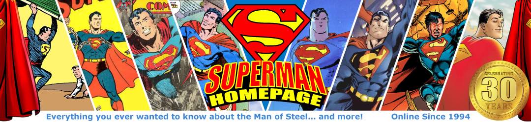
The cover photo for the March 2013 edition of "Empire" magazine featured Henry Cavill in the Superman costume for "Man of Steel" standing in a very similar pose from a very similar angle, making it idea for a side-by-side comparison with this new image.
This new photo (taken by Clay Enos by the way), appears to show Superman on a rooftop somewhere in Gotham city on a rainy night (is there any other kind in Gotham?).
Going from head to toe... The most obvious difference is the hair. Admittedly, with the rain falling, the slicked-back hairstyle could be due to the rain. However, it does appear Henry's hair has been cut shorter for this movie, which is a good thing in my opinion. It makes him look more distinguished. Also, the slicked-back hairstyle worked for both George Reeves and Dean Cain.
The cape seems to be the same. It sits on his shoulders and attaches to the costume in a very similar fashion to the previous film. It's hard to tell if the length is the same, but that's really neither here nor there. I know some fans would prefer that it didn't drag on the ground.
The "S" shield does seem to be softer and sit lower. Or the neckline could have been raised higher (will we still see Henry's chest hairs popping out over the top?). But there's definitely a larger gap between the "S" and the neckline, which looks better in the new costume. The yellow in the "S" does appear to be brighter, which was my main gripe with the "Man of Steel" costume personally. Additionally, there does seem to be some fine line-work within the red of the "S", replicating what was in both the movie logo on the posters, and in Jor-El's own costume.

It's hard to tell with the difference in lighting, but the blue seems a little brighter as well. This is a night shot, and the blue seems to stand out more than it does in the Empire magazine photo. But I think we'll have to wait for more photos and actual footage to be able to properly assess the colors in the costume over all.
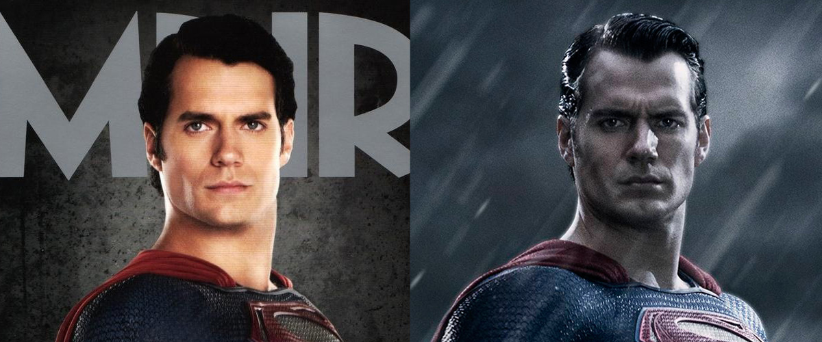
The wrist gauntlets have changed considerably... although I think for the better. While the design goes further up the forearm, the rigidity of their design is softened by the gaps between the ridges.
Similarly, the designs on the torso, around the ribs and waist appear to also have crept higher up, but again with more gap between each ridge, making it somehow more streamlined.
The "belt" design has also gone through quite a noticeable change, with the color seeming more gold and metallic. It also appears to have some kind of intricate design imprinted on it, which may be Kryptonian writing. I say this because the "buckle", which has changed from an oval to a rectangle, appears to have a Kryptonian glyph "S" on it.
It's hard to tell in this photo how much change (if any) has taken place with the designs on the thighs seen in the "Man of Steel" costume.
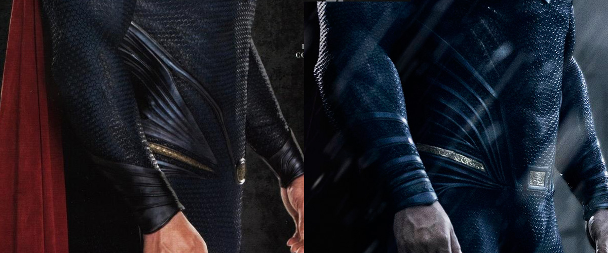
As for the boots, the Empire magazine cover photo didn't extend down that far, but using a photo of the costume from elsewhere, there does appear to be a doubling of the ridge line at the top of the boot, with the V below the knee looking maybe a little more acute, but it's hard to tell and could just be the angle.
As for Henry, he does look a little older (again, that could be the hair style) and he also appears to have put on more muscle this time around, especially in the chest.
There have been some complaints about him not smiling or the photo being dark and brooding... I don't imagine there'd be much to smile about when you're in Gotham on a miserable, rainy night.
All in all, I'm happy with the tweaks costume designer Michael Wilkinson has come up with for the Superman costume in "Batman v Superman: Dawn of Justice". They're subtle improvements, which makes sense when considered within the context of the film. If they were too noticable or too different, people would wonder how Superman managed to change an alien costume that was given to him by Jor-El.
Steve Younis