![]()
![]()
![]()
![]()
![]()
![]()
Dark Knights of Steel #1
Scheduled to arrive in stores: November 2, 2021
Cover date: January 2022
“In the Beginning”
Writer: Tom Taylor
Artist: Yasmine Putri
Cover: Yasmine Putri
Variant Covers: Yasmine Putri, Joshua Middleton, Wayne Reynolds
Reviewed by: Craig Boehmer
I will try to avoid spoilers… because those spoilers are so cool!
Krypton blows up, Jor-El and Lara arrive on earth. They are quickly confronted by Medieval warriors, whom Jor-El blows away with heat vision. Kal is then born. Meanwhile Constantine is having a seizure and prophesying to the King of the Kingdom of Storms. He concludes by saying he has seen the end of their world. Nineteen years later Kal wants to go with Bruce to confront a magic user in the kingdom. Magic has been outlawed in the kingdom because it can hurt the Els. Kal is not allowed to, but he follows Bruce to the magic user, and ends up saving him from a girl called Banshee (Black Canary). Kal and Bruce return to the throne room to report, and Kal gets into an argument about putting himself at risk around magic users and with Bruce about traditions. It is revealed that the kingdom used to belong to the Waynes, until their murder led to the Els coming to power. Bruce and Jor-El go for a walk, and that’s where my summary will end, but significant things happen while they go for a walk.
 Story – 5:It starts a little slow, but we do have twelve issues. I am more excited for this than any story I have read in a long time. I love “Lord of the Rings,” the “Shannara” world, and many other fantasy series. I obviously also love the DC Universe, and I adored what Tom Taylor did with the “DCeased” universe. So I was ecstatic to hear about this series. The characters look like they will be a joy to read. And I am here for the fun. I like seeing Kal and Bruce as youthful friends ready for an adventure.Art – 5: The art works for this type of story. The color palette is whimsical in nature. This is my first exposure to Yasmine Putri, and I like it. I hope Putri stays on this book for the whole series. The art is so fanciful and fun.
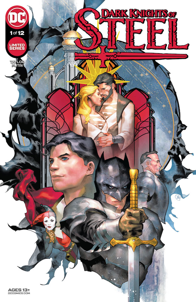
 Cover Art – 3: There is a lot that I like about this cover. Showcasing Batman and Superman as the forefront with the Els and Alfred in the background gives ample room for the primary characters to be shown off. It is great, and a great introductory image to the story. However, I wish it took up more of the cover, having so much white in the background detracts from how great the image is.
 Character Sheet Variant Cover Art – 4: This image is a cool concept, but it does seem a little plain. I think it would have been better to use an action shot of Superman for this. Plus I can’t be the only Superman fan who looked at his stats and thought they were all too low. How can a superpowered brain only rate a 17 in intelligence? And 16 in stamina? His body is a battery powered by the sun! Other than that though, the art is fine.Open Order Variant Cover Art – 5: This cover is everything I wanted in this series. It looks like Batman as a freaking ringwraith!!! So great. The coloring is fantastic, and creates a somber chilling image. This Batman is terrifying, and I love it.Team Variant Cover Art – 3: This cover should have been a slam dunk. It gives an artist the chance to show the redesigned trinity for this world. Instead it falls flat. The faces look wonky, the colors are dull and muddy, and why are there so many rings? The actual designs for the characters are intriguing though, and I can’t wait to see more of them, especially Batman’s armor.
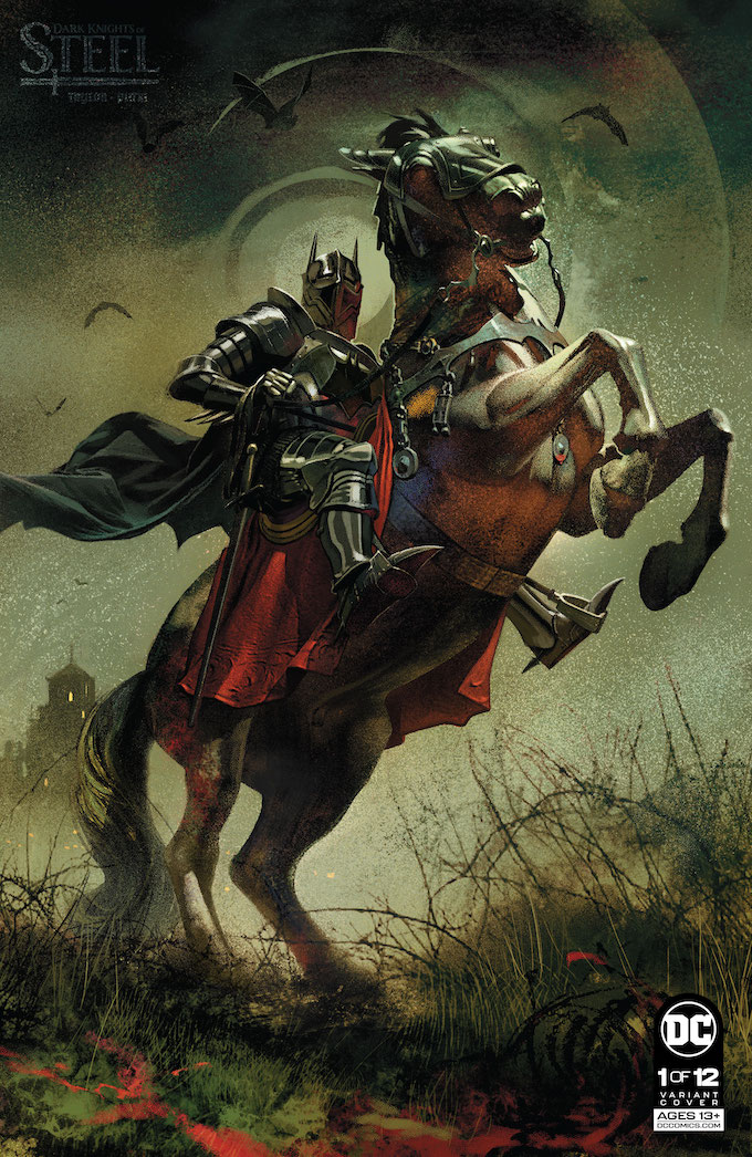
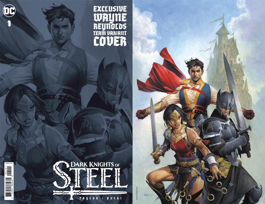
Check out the Mild Mannered Reviews contents page.