Superman Comic Books
The Evolution of Superman's "S" Shield
 By Steve Younis
If you had to describe Superman's "S" Shield without the use of a visual aid, you could say that it is usually a diamond-shaped pentagon with a stylized "S" inside it, with that "S" usually having an upturned serif at the head (top right), and a bulbous, round tail (bottom left). Combined together, the "S" and the pentagon are usually red in color, with the negative spaces of the "S" colored yellow. The entire design is usually outlined in black.
You'll notice the repeated use of the word "usually". That's because the Superman "S" Shield has varied quite a bit over the years. Every element described in the above paragraph has been altered in some way, shape or form. The serif has been made up of one prong, sometimes two. It has been positioned vertically, horizontally and diagonally. The tail has been oval shaped, circular, squared off, or removed all together. Every element of the "S" shield has been made larger, smaller, thinner, thicker, taller, shorter, rounder, straighter, sharper, curvier, lighter, darker, textured, non-textured, bevelled, embossed, with variations in colors, tones, backgrounds and special effects.
Different artists have drawn it in many different ways. Artist John Byrne famously stated that he grew up thinking the emblem on Superman's chest depicted two yellow fish swimming in opposite directions on a red background... and that's how he learnt how to draw it.
According to Superman's co-creator Joe Shuster, "Jerry Siegel and I came up with the 'S' insignia - we discussed it in detail. We said, 'Let's put something on the front of the costume.' From the beginning we wanted to somehow use the first letter of the character's name. We thought S was perfect. After we came up with it, we kiddingly said, 'Well, it's the first letter of Siegel and Shuster.'"
As for the shape and design of that insignia he said, "Initially I made it like a shield, a fancy little triangle with curves at the top. I had a heraldic crest in the back of my mind. Progressively, as the strip evolved, the emblem became larger and larger."
The design of the "S" insignia not only grew in size, but it changed shape quite a lot in those early years following Superman's debut in "Action Comics #1" (dated June 1938). It wasn't until 1945 that National Periodical Publications (now known as DC Comics) settled on a design and registered it as a Trademark. That design is pretty much the same "S" Shield we know today. However as I mentioned above, alterations to this familiar design have been many and varied over the years since.
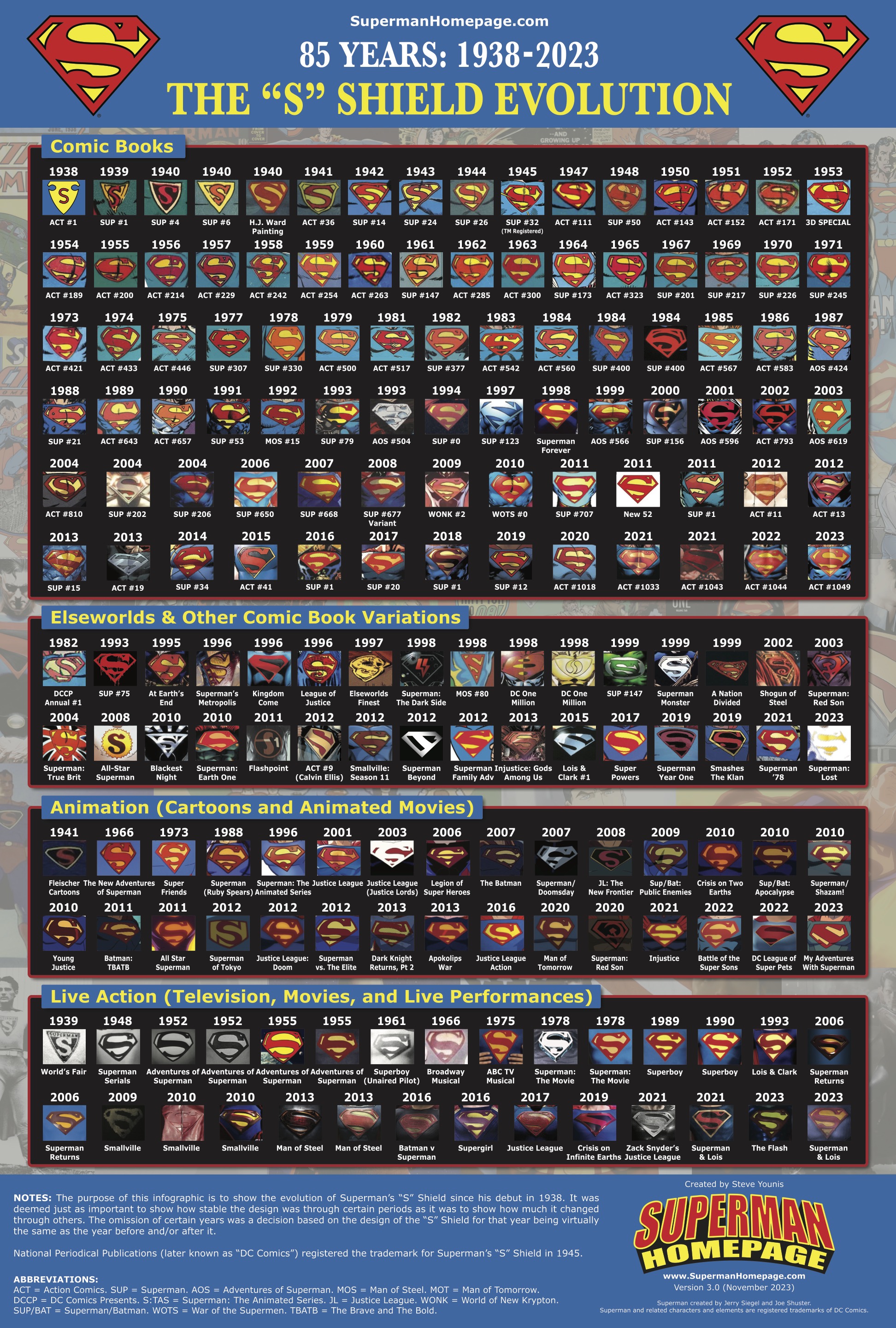
There have been quite a number of attempts by various people to create charts, images and graphics showing the changes to Superman's "S" Shield over the years. Most of these are quite well done and very informative. Back in 2013 the Superman Homepage create our own detailed chart, showing how Superman's "S" Shield had evolved over 75 years... Now, for Superman's 85th anniversary year, we've updated the poster to cover 1938-2023. Using Superman's regular comic books, original graphic novels, Elseworlds, and other publications, as well as cartoons, TV shows, animated movies, films and more, we are happy to present the 2023 version of our Evolution of Superman's "S" Shield graphic.
The result is an enormous chart showcasing over 180 different "S" Shields spanning 85 years!
The chart includes examples by many of Superman's most renowned artists including Joe Shuster, John Sikela, Wayne Boring, Curt Swan, Al Plastino, Neal Adams, Jose Luis Garcia-Lopez, John Byrne, Dan Jurgens, Jim Lee, Shane Davis, and many, many more.
I have no doubt that there will be a version of the "S" Shield somewhere along the line that has not been included. With thousands of comics, hundreds of episodes, and so many variations of the "S" emblazoned across T-shirts, lunch boxes, magnets, key rings, and every other merchandise item you can think of, there are literally thousands of variations on the "S" out there. There are "S" Shields of varying colors, ones with national flags inside, some with other images inside... but these tend to all fit within the trademarked "S" you're all familiar with, so they don't really count. What we've tried to focus on is the shape and design of the "S" more than variations in colors or anything else. We hope we've succeeded in that regard.
We did not include the "S" shields of Superman family characters such as Jon Kent, Steel, Superboy, Supergirl, and Krypto, as they tend to be the same shape as Superman's in most cases, just with slight variations for their own particular costume. Bizarro also falls under this same explanation, as his shield is usually just Superman's in reverse.
As you'll note, the version of "The 'S' Shield Evolution" chart is classified 3.0 (November 2023). We're happy to receive feedback, suggestions and corrections for future updates to this chart.
A FREE high resolution printable PDF version of this poster will be sent to select members of our YouTube Membership program and Patreon Patrons on November 30. Not a member? JOIN NOW!
Note: Many, many hours of time and effort were put in to create "The 'S' Shield Evolution" chart. Many thanks to the Superman Homepage staff members for their suggestions, corrections, and encouragement along the way.
Steve Younis