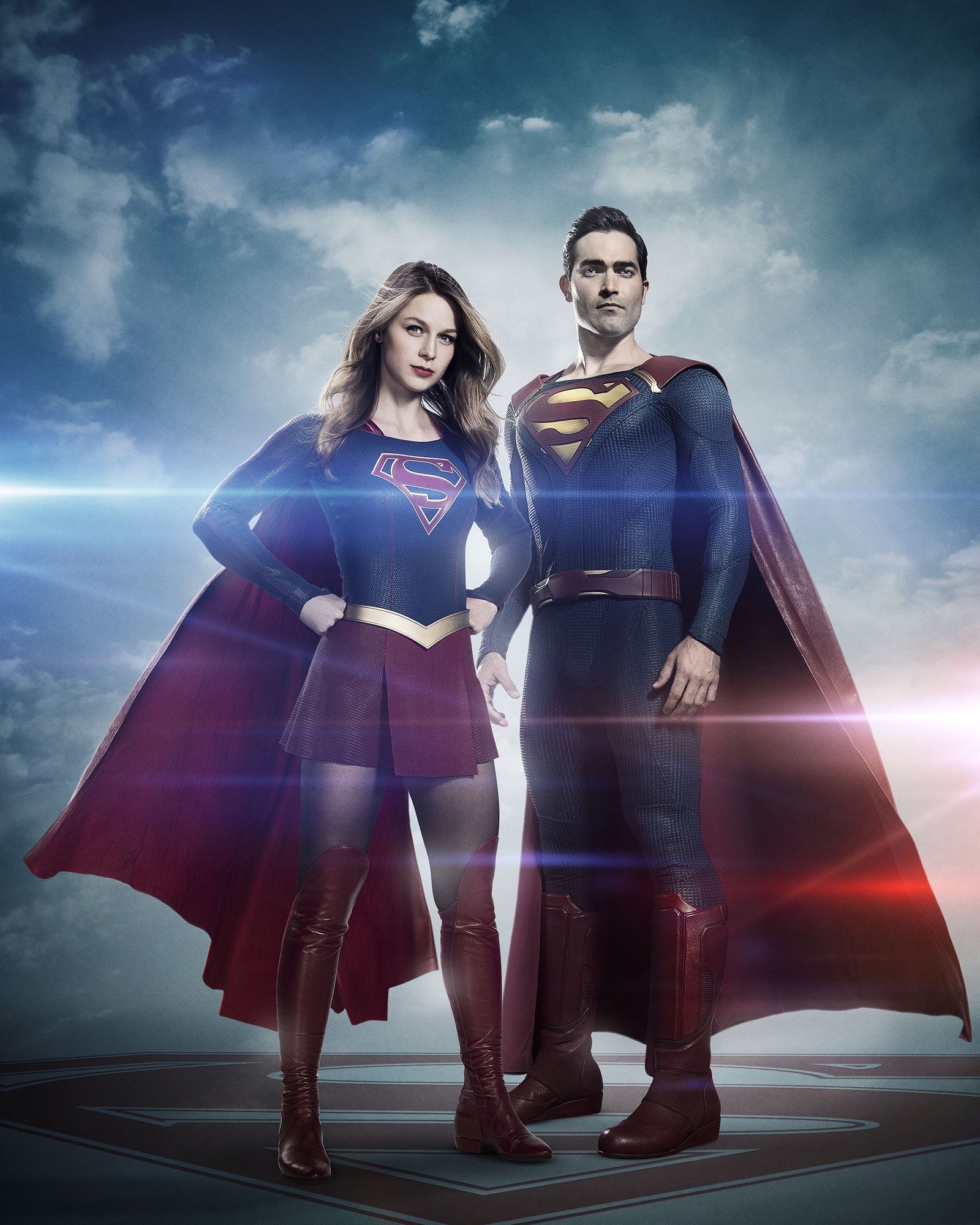
The CW has released a new image, giving us our first look at Tyler Hoechlin in the Superman costume for Season 2 of “Supergirl”.
DISCLAIMER: SUPERMAN and all related elements are the property of DC Comics. TM & © 2024
This Superman Homepage is Copyright © Steven Younis 1994-2024
All Rights Reserved
Dedicated to Andrew J Gould - the original keeper of the Superman Homepage!
Since May 2001, the address is www.SupermanHomepage.com
Our Privacy Policy.
ill wait to see them in action… these image doesnt look good,
but always happens in the first image
Yikes. This picture looks very bad to me. The belt looks like it’s just floating and serves no real purpose. And Tyler’s face looks like it’s CGI or badly photoshopped or something. And what is with the seeming moratorium on the spit curl ? The whole thing just seems off. Oh well, hopefully it will look better on screen.
You are right, the belt serves no purpose at all and his face looks like someone photoshopped it in.
I didn’t expect the red trunks, but I think it would look nice.
I like the yellow in the S-shield and I wish Supergirl had the same thing. His boots look too mechanical and it would have been nice if the blue and red were brighter.
But won’t both of their costumes be brighter in the episodes? Supergirl’s costume is definitely brighter on the show when I watch it.
I don’t understand why they show the colours duller here than when they appear in the episodes.
???
When has literally any superman belt served remotely any type of actual useful purpose?
Yikes to your moronic comment.
Of course it has purpose. That’s where he keeps his extra cellophane shields when he’s already thrown the one on his chest. Duh!
I LoL’d at this.
The belt helped keep his trunks/pants in place. Yes the suit is already form fitting, but the belt inside the looped trunks keeps the suit looking symmetric and tidy…the same reason many people wear belts in real life, and are even required to wear them as at certain jobs (they’re almost ornamental; pants just look better with a belt if you’re in uniform)
The belt keeps the red trunks and pants in place. Don’t be so silly.
I like both of their suits. I love the similarities and the differences. But it feels like there’s something wrong with Tyler’s face in this photo. It’s strange. I find Supergirl looks serious and Superman looks emotionless. Very strange.
I think they should change his facial expression… unless this is exactly what they were going for.
Anyway, I like their suits. I like that different Supermen have different suits in different shows and movies. It’s one way of preventing audience confusion.
His face looks like he was eating something, then paused for the camera. LoL
It… uh… grows on you the more you stare at it. Honestly, what’s with everybody not getting the belt right? Look at Smallville S11 and do that. It’ll suffice. Also, never, ever make the belt red. It makes the look too monotonous and makes the shield stick out like a sore thumb– in a bad way. On another note, the photoshop job on this is embarrassing. It’s almost surprising they chose to release this, without touching it up a bit more. Both actors look weird, their faces are a tad too alien. Don’t get me wrong, still excited, it’s Superman… Read more »
I agree, Smallville s11 has had the best belt so far. I also liked the Earth2 n52 belt
Infinitely better suit than the Man of Steel version, but the Superman Returns suit is still the overall all time best by a country mile.
That’s interesting. Because I like it better than the SR suit but not as much as the MOS suit. The MOS suit has really grown on me. In not saying you’re wrong. I just find it interesting.
Although I didn’t like how the SR suit was executed (tiny “S” shield, “S” on belt, the colors, etc), it at least had all of the proper parts to the Superman suit in place (red trunks, yellow belt, etc), and for that I definitely prefer it to the MOS suit and this one.
Yeah. The buckle was my big problem with it too. I also didn’t like the small shield or the closed neckline. I also thought the blue was an odd shade.
Lol the red trunks are still nowhere to be found. With the Donner influence, I thought the trunks might be present. People are going to lose their minds even more now
There’s a mandate against the trunks.
Dc is sadly on an anti-trunks crusade for all of their characters. Rather ridiculous, but hopefully they’ll get over it one day.
Ehhh.. Not the best nor the worst suit. Do love the shield though. Not a fan of how the cape is connected, but I suppose I can get used to it. The blue portion is fine. Belt and boots look clunky though. I was sort of expecting a more cosplay vibe for the TV version so it’s not completely jarring to me. Is it just me or does he look like Morrissey or Clive Owen in this picture? I’m sure everything will look better in live action.
kel, what do ya think? i now the shorts are gone, but beyond that?
personally, i like the texture of the suit, the size and color of the shield, and i can even dig the belt, though i’d like more yellow (perhaps in the buckle area). i’m not too fond of the cape. perhaps a little rubbery or something, however the length is nice. but overall i dig the costume…as for the actor, i’ll wait and watch!
Superman ‘s new costume I like it a lot it’s a mix of The New 52 and DC Rebirth Costume.
Good lord… blue filter much? Where was Johns on this one? lol
Not so crazy about the suit, but then I hated the first Flash suit images and I love that now… so I’ll wait to see it in action.
Here’s the “fixed” version, tried to “de-blue” it as much as possible:
http://jamiekelleymusic.com/sh/image-1-bluefilterremoval.jpg
That lensflare though…holy crap…
Melissa Benoist looks great, but that is a horrible image of Tyler Hoechlin.
That’s JJ Abrams levels of lens flare…
Correct me if I’m wrong, but this promo image reminds me of the Smallville Season 10 cast posters. Standing on an S shield, surrounded by clouds, and a bleak looking filter.
Costume looks good. Jeez some of you are nick-picky! Be glad this costume doesn’t have the new 52 collar or plain shirt/jeans!
I do miss the classic trunks (Batman included) but the red belt will do. Nice if Supergirl gets yellow background for her “S” like her cousin. But generally both costumes look good.
That is a terrible photoshop job, really making it hard to judge, But from what I can see they took the worst parts from the new 52 with all the seams. the belt and boots look weird, like rubbery and I really don’t care for the cape, neither the way it attaches nor the cut. I also don’t like the cape fabric, it looks like pleather. I don’t mind the texture and the “S” shield looks great.
It’s not a very good picture. That being said the two main problems I have are the belt and the maroon colors…however the colors could just be a product of color correction for an obviously photo shopped picture. The other is the belt…I have no problem with the concept of the belt but it seems bulky or clunky.. They can fix that at some point fairly easily. This designer has nailed it in my opinion previously to this suit, so I feel like She will get there eventually. The suit looks like it is going to b based on the… Read more »
Likes: The “S” shield. It looks really great, very happy it’s not the Snyder or Singer “S” for once. Also happy that this Superman has no gauntlets like Snyder and the New 52/Rebirth people seem to keep giving him, as though he’s Captain Marvel. I also like that he isn’t armored all over. Dislikes: the lack of red trunks, the way the cape is attached to the shirt like Thor, the big plastic looking red utility belt , the Iron man boots, and the honeycomb/reptile-like skin texture they keep giving the shirt and pants. I also dislike the lack of… Read more »
Not a very inspiring photo of Superman, just doesn’t look good in the photo. Personally not very happy with the choice to play Supes, but hoping he will turn that opinion around watching him in actìon. So, we shall see come October 2016! Take care….. Peace To All
Looks a lot like the New 52 suit, sans collar.
If the cape wasn’t so weird looking at the attachment and the boots were less bulky, it’d look better… Now that we have learned there actually is a mandate against the trunks!
Will have to see it in action to really judge it… But first impression of it sadly isn’t the best… Tyler looks to small… Maybe some padding would have been a good idea?!
Here’s another thing to remember. Superman shouldn’t out shine Supergirl because it’s her show. I think that might be one reason why he’s not quite there for us.
Beside the fact that it would be the first live action appearance EVER between the Super Cousins to embrace the screen, I wonder if there is a yellow ‘S’ on the Cape. Suit looks OK I guess. Maybe we shall see a different version soon.
Disappointed because the shot doesn’t give justice to Tyler’s physique.. I’ve seen him in Teen Wolf and he def looks bigger than this. The shot is just.. unflattering for both body & face. We really need to see it at diff angle/lighting. Sad though because people all over social media are calling it lame. Terrible job by the network.
There’s so much wrong with this I don’t know where the start. How the cape attaches however is the worst & most unforgivable offender. Tyler also looks like he’s chewing the side of his face, so it’s a bad photo too – no offence to him, as I said it’s a bad photo.
Overall I like it. But I do have a few minor gripes. The belt is a bit bulky. It looks even more ridiculous next to Kara’s belt, which is simple and perfect. Why not just copy hers? Also, Too much collarbone for my liking. #ManCleavage
I Love that the yellow was replaced by gold. Looks more Regal. I’ve been wishing they’d do that in the comix for 20yrs now. LoL.
In summary, Clark needs to copy Kara’s belt, and Kara needs to copy Clark’s S-shield 🙂